This should be read in conjunction with our catalogue.
The technique of onglaze enamelling Jingdezhen porcelain began in the early Ming dynasty. The colours were derived from metallic ores, including: iron, manganese, cobalt and copper. During the ensuing three hundred years the refinement and increased complexity of the palette allowed the porcelain decorators to reach heights of sophistication paralleled only in the exclusive Nabeshima porcelains of Japan during the Edo period and in Europe in the 18th century.
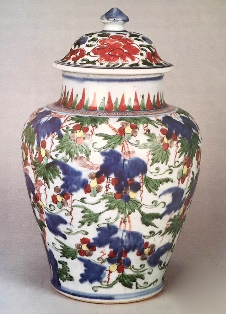
The Chinese potter had a number of combinations available to him by the beginning of the Qing dynasty in 1644, although only one wucai (literally "five colours") was generally employed. Catalogue number 46 is a typical example of mid 17th century colouring. The palette includes an inky underglaze cobalt blue used as a wash and not as an outline seen on the more delicate doucai porcelains of Chenghua and the later Qing revivals; a rich emerald green derived from copper (although it is often used in conjunction with a paler shade); iron red; a brownish colour derived from manganese (this can vary from a pale mushroom to a dark purplish tonality); yellow which is usually a rather brownish or dirty egg yolk colour (clean lemon yellow is never encountered on genuine 17th century pieces). Turquoise may be found on a few pieces at this date but it was more popular in the late Ming and again from the early 18th century. Finally black, which is used mainly for outlining or detailing is a combination of manganese and iron. Overall there is a somewhat weighty or sombre feel to most wucai porcelains, at least by comparison with the later famille verte porcelains, probably because of the dominating presence of the dark cobalt.
Themes on the polychrome wares of this time, the so called 'Transitional' period, are not much different from contemporary blue and white narrative subjects based on romantic tales or epics; iconic figures, particularly Daoist immortals, sometimes shown isolated in a bleak spare landscape; large scale flowers or other vegetation. A development of these mid 17th century years was the use of all covering or continuous decoration i.e. with no base or shoulder panels on the main body. This is most clearly seen on blue and white wares where a story is wrapped around the contours of the vessel, only interrupted by a shoal of clouds or banana plantain. It is perhaps better observed with natural subjects such as on the above mentioned jar (no. 46). This is a charming example with tree shrews or pine rats gambolling and gorging themselves on plump fruiting vine a never ending feast. More common as a 'wallpaper' pattern is either peony or lotus, their flowerheads set in a dense carpet of scrolling stems. A blue and white jar with scrolling lotus arranged in this manner is in the collection at Burghley House where it is referred to in the Devonshire Schedule of 1690 as "running worke (sic)". However this latter piece which is slightly earlier does have a rudimentary lotus petal band about the foot and is therefore unlike our wucai specimen which boasts no other ancillary decoration on the main body.
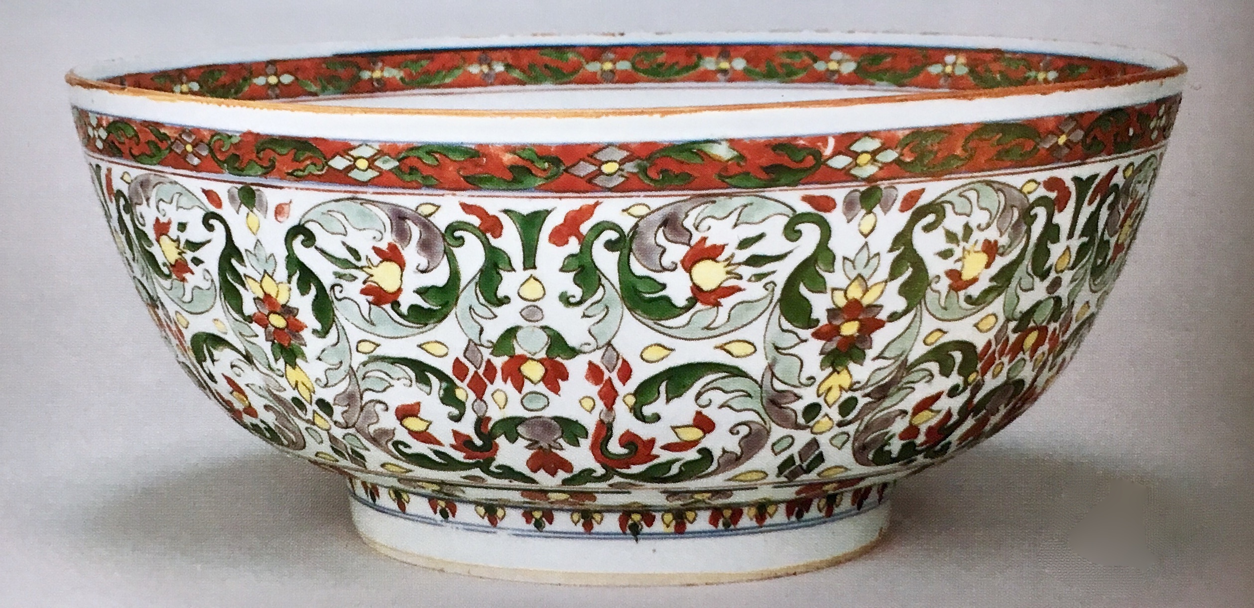
The large wucai bowl (no. 47) is an intriguing variation of wucai in that the only underglaze blue is to be seen on the horizontal lines defining the different bands of decoration and the upper and lower margins. Note here the two tones of green as mentioned before and the formal tightly curling feathery scrolls of a curious non Chinese nature. A considerable number of pieces of porcelain with similar vegetation are known in India and the Middle East and it is likely that the design originates from there. Whatever the origin, the more pastel tones signpost the fresh vernal famille verte porcelains of high Kangxi. Furthermore the highly structured arrangement also slightly anticipates the formality of Kangxi border panels which were so influential on the contemporary faience potters of Rouen. The so called lambrequin motifs of Rouen and Lille owe as much to Kangxi porcelain as to the regional lacework of northern France.
Supplanting underglaze blue with the richer tones of overglaze cobalt was the final stage in developing the famille verte palette which probably took place in the final decade of the century. Clearly there were problems achieving this switch as there are many examples in this group which indicate essential difficulties in the firing of the cobalt. There is a tendency for this enamel to flake off, especially where the colour has been liberally applied as a broad wash. This is probably why overglaze blue was mostly used for detailing whereas manganese and green were used for washes. Eventually this weakness was overcome and a fine deep cerulean achieved. The pair of biscuit dogs of Fo (no.56) are flamboyant specimens of famille verte in its most baroque manifestation little of the white porcelain is allowed to show. The beautiful pair of bottle vases (no.54) are a subtle counterpoint to these figures. Both the delicacy and restraint of the brushwork and the sensitive springlike effect characterise the very best of Kangxi famille verte. Without the underglaze blue roman letter 'G' on each base it could be argued that these are closer to Chinese taste than to export porcelain, indeed here the gap is very narrow.
Another type, sub species of the famille verte group, are those wares or figures decorated in green, yellow, manganese and white without cobalt. In this group the enamel is applied directly to the unglazed or 'biscuit' porcelain body. The term email sur biscuit coined by French connoisseurs in the 19th century is concise and appropriate. The Buddhist lion joss stick holders (no.56) are perhaps the best known plastic form. The shrine (no.48) is a much rarer model.
Related to this type, or simply a variation, is famille jaune; the only difference is the use of yellow as a ground colour. No.52, a footed baluster vase, is a good example of this very rare formula.
A somewhat neglected group, at least in academic terms, is Chinese Imari. In the late 17th and early 18th century the potters of Arita produced huge quantities of porcelain, mostly for the export market: blue and white; Kakiemon and Imari. The last two are polychrome wares and to a Europe awash with blue and white these must have been a welcome change. The popularity of coloured Japanese porcelain encouraged the Chinese to copy or mimic these types, especially the Imari type. Chinese Imari porcelain was made for many years from Kangxi until well into Qianlong. Much of it is attributed erroneously to the former reign. There are three excellent examples in this catalogue nos. 49, 58, 60, 61, 102 and 105. The basic Imari palette of underglaze blue, iron red and gilding (often these are supplemented with other colours including yellow, green, manganese and more rarely turquoise) is seen on the double handled ecuelle (no.58); a more extensive palette on the chrysanthemum shaped dishes (no.49); and an unusual variation where a bird on a rock has been rendered in subtly worked sepia tones (no.61).
Towards the very end of the reign of Kangxi, the Chinese developed a new range of colours. Unlike the brilliant translucent colours of famille verte, this emergent group were pastel in tone, each colour seemingly saturated in white, making them appear opaque. To Chinese scholars and collectors this group is termed fencai but in the west it has been known as famille rose since Jacquemart bequeathed it to us in the 19th century.
Until recently many authorities believed that the technology required to produce the famille rose palette was introduced from the west via Jesuits at the Imperial court. However research, much of it conducted in the United Kingdom refutes this notion. In addition to the colours available to the potters of Jingdezhen at the beginning of the century manganese brown, copper green, iron derived yellow, cobalt blue, iron red and black pigment, the Chinese were able to make pink from gold, a white from lead arsenate and a yellow from lead stannite. Furthermore black, formerly only used as a pigment which necessitated a protective coating of clear enamel, could now be used as a straightforward enamel. And finally brown such as that used on number 61 was introduced to complete the range of colours. Whereas it had been impossible to modulate the colours of the old famille verte palette the decorators were able to create an inifinite range of tones by mixing colours or saturating them with white. With the different consistency of the enamel it was now possible to utilise the brush in the manner of an English portrait miniaturist. The exquisite specimens of imperial porcelain painted in Chinese taste or for that matter after European engravings attest to the full development of these enamels in the reign of Yongzheng. It is a strange coincidence that in the second decade of the 18th century porcelain decorators at the Imperial court in Beijing and at Meissen under the patronage of Augustus the Strong had attained commensurate levels of skill in handling small scale painting and employing virtually identical colours.
Early famille rose export porcelain of the Yongzheng and early Qianlong periods can reach a very high levels of refinement similar to the design and execution seen on Canton enamel (see nos. 69, 120 and 121). European and American books and catalogues on Chinese porcelain published at the turn of the nineteenth century indicate that collectors of enamelled ware held this group in the highest regard. The precise painting on the celebrated ruby back plates represented the very best of Qing porcelain.
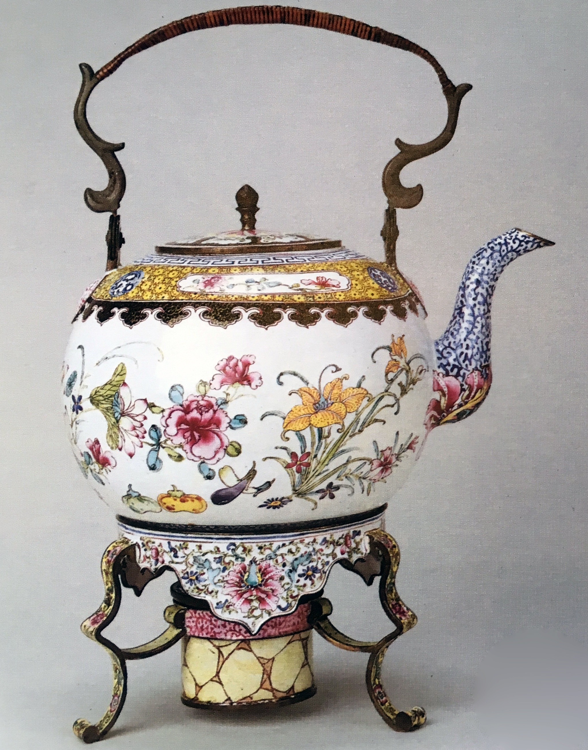
121. AN ENAMEL TEA KETTLE, STAND AND BURNER, QIANLONG (1736 - 1795)
The best of these early famille rose porcelains are painted with sharply defined outlines often with figure or family subjects or with birds and trailing peony. There is much use of geometric border patterns of which cell diaper is probably the most common. Progressing beyond the middle of the century formal borders of scale patterns are for a while, if not entirely abandoned, at least eschewed in favour of trailing flowers or narrow bands of spearhead, whorl or trellis (see nos. 82, 75 and 108). Towards the end of the century underglaze blue is often used for borders, the rest of the design rendered in famille rose. At this time the borders have again become complex, sometimes employing more than one diaper pattern (see nos. 80, 100 and 103 ). Generally the brushwork is looser and less well defined, and in some ways espouses the irregularity of the European rococo (see no. 113).
While figure subjects are quite popular on Yongzheng and early Qianlong porcelain, they are supplanted around the middle of the century by flower and bird patterns, either flowing freely across the surface as on the porringers and tureen (nos. 75 and 95) or issuing from rockwork (nos. 72 and 95). Neatly painted river landscapes with pavilioned islets and mandarin figure subjects (nos. 100 and 80) become more evident in the last third of the century. In keeping with the demands of European neo classicism many late eighteenth and early nineteenth century export porcelains are very sparingly decorated in palettes often restricted to monochrome (en camaieu), the vase (no.86) is a good exemplar of this period. This conservative style was soon swept aside in the early years of the nineteenth century by the so called Canton type of exportware. Grossly over decorated in famille rose dominated by pink, green and gilding with panels of figures on a dense carpet of butterflies, birds and flowers.
In terms of colour, the second half of the century witnessed a change in the chromatic balance of famille rose. Pink enamel takes on a harsher look, more a puce colour, again in keeping with the dominant purple manganese seen on most German porcelains during the high rococo between 1750 and 1760. A comparison between the earlier porringers (no.75) and the later tureen (no.100) makes this clear.